Paper, canvas, acrylic: how to choose.
A plain-language guide to the four finishes, and which room each one is really for.
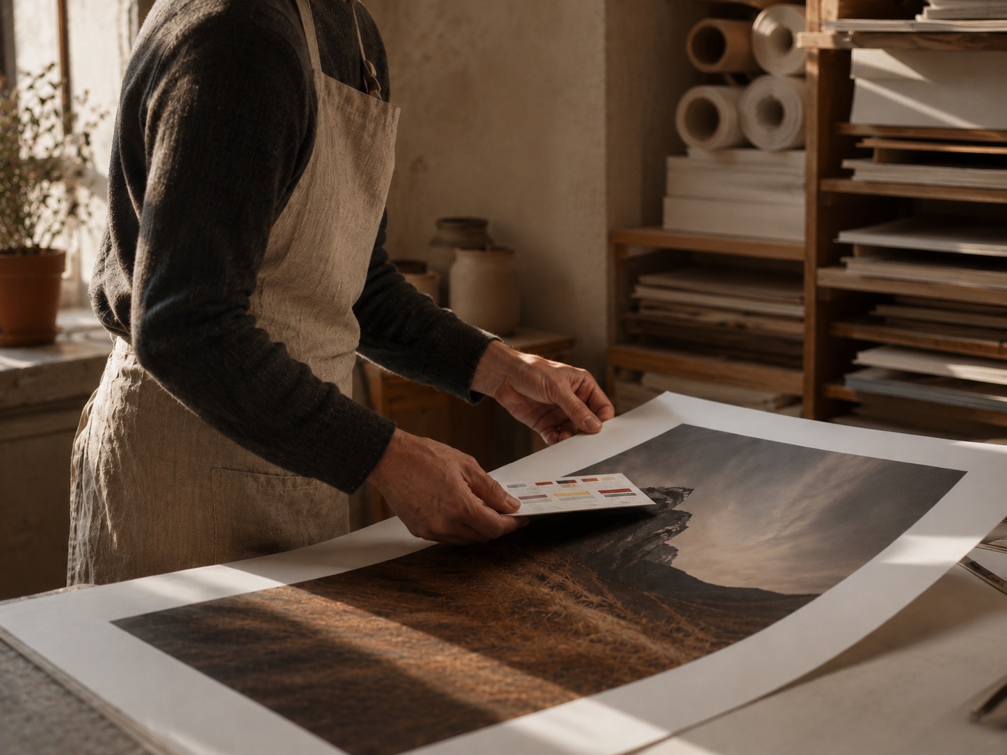
Every image we print gets colour-read against its material before it goes to press, because the material is half the picture. Here is the honest version of how to choose, without the brochure voice.
Museum paper is for framing and for daylight. Matte, 270 gsm, no glare; detail and soft colour live longest here. If the work is delicate — portraits, night scenes, anything with paper-like texture — this is the default.
Cotton canvas adds warmth and body. No glass, so no reflections; colours sit a degree warmer. It suits larger walls, folk portraits and anything painterly — and it forgives busy rooms.
The image chooses the material. You just have to listen.
Acrylic glass is contrast and depth: colours behind 5 mm of gloss read wet, modern, lit from inside. Best for graphic work and bold scenes, in kitchens, bathrooms and offices where paper would sulk. Framed editions, finally, are for when you want it done: oak, ash or maple, hardware fitted, on the wall in five minutes.
Still unsure? The sizes & framing guide goes deeper, or ask the studio — a person answers.
See what is hanging now.
A rotating catalogue of numbered editions, printed to order in Europe.
Browse editions →