Folk portraits, and the rooms that can take them.
A short defence of full colour, and why one bold portrait can settle an otherwise quiet room.
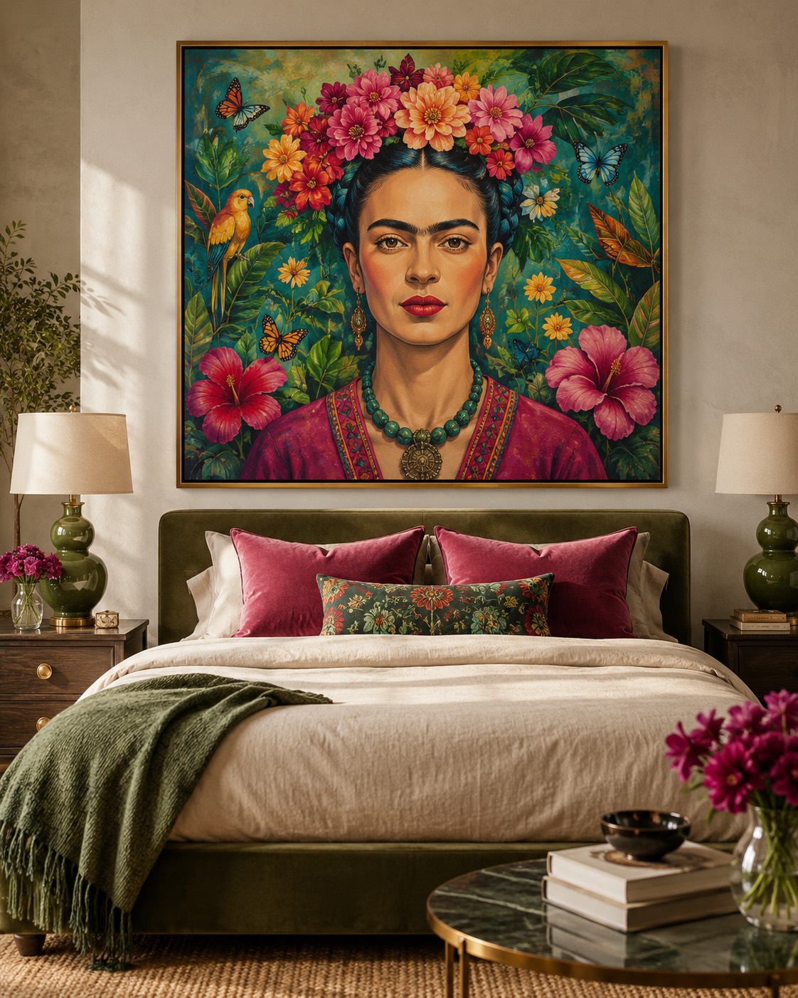
Somewhere along the way, colour became something to apologise for. Interiors went greige, walls learned to whisper, and art was chosen the way one chooses a carpet — to disappear politely. The folk portrait argues the other case: a flower crown, a hummingbird mid-air, a gaze that does not look away.
The trick is not restraint but placement. One saturated portrait above a bed of unbleached linen does more than a dozen careful prints. Give the work a calm room — plaster walls, one lamp, wood that has aged — and let it be the only thing raising its voice.
A bold portrait is not loud. It is simply the only one in the room speaking.
Framing wants to stay thin: oak or a narrow gold edge, no mount, so the colour reaches the frame the way a garden reaches a wall. Behind glass on museum paper the pigments read like gouache; on canvas they warm up by a degree.
At 50 × 70 a folk portrait is a presence; at 70 × 100 it anchors the room and everything else arranges itself around it. Start in the bedroom — the room most likely to have stayed quiet enough to deserve it.
See what is hanging now.
A rotating catalogue of numbered editions, printed to order in Europe.
Browse editions →