Darkness, as a design tool.
What the Baroque understood about drama, and how one dark, glowing piece can hold an entire living room.
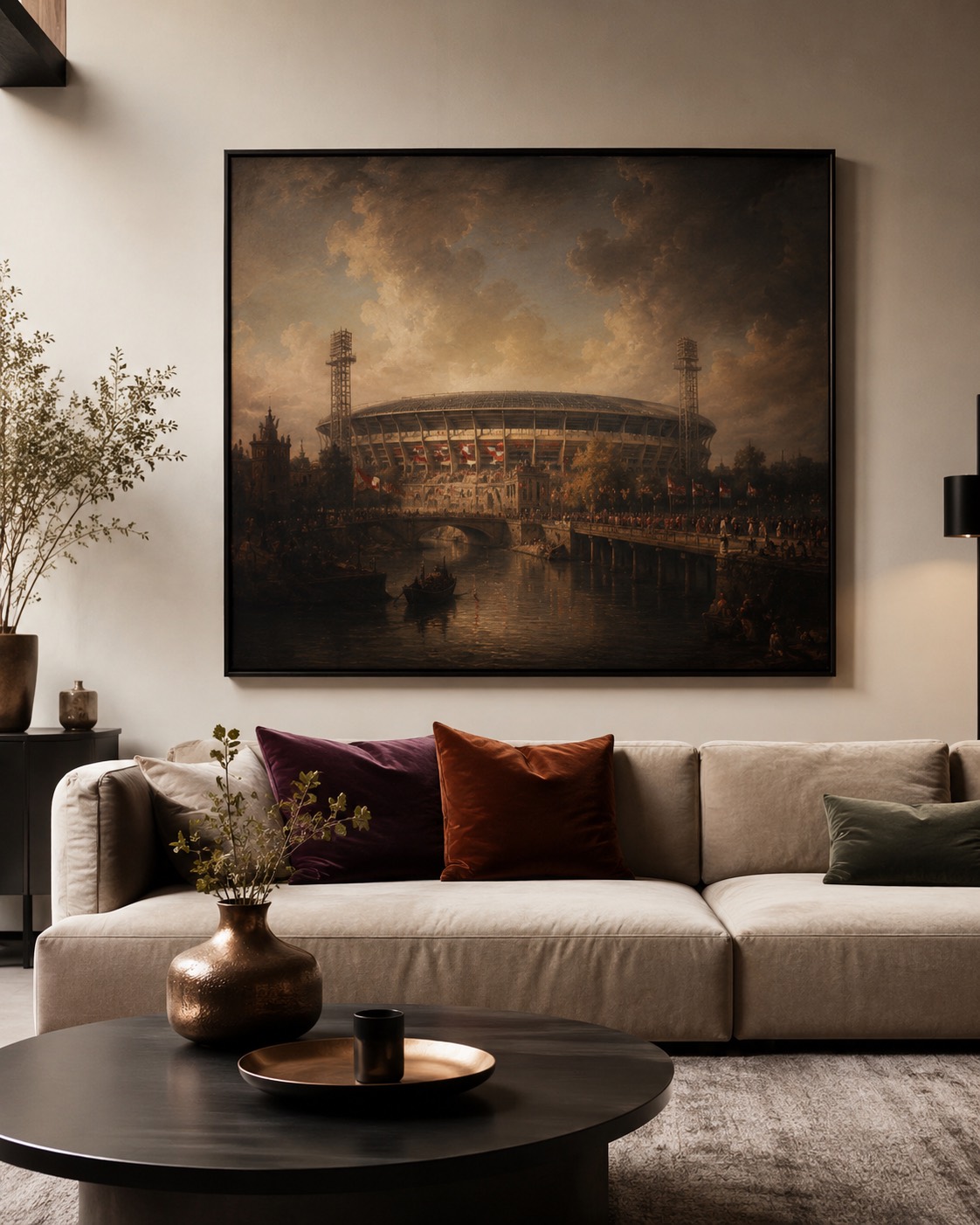
We light our homes like waiting rooms and then wonder why nothing in them feels important. The Baroque painters worked the other way round: they understood that darkness is not an absence but a stage — the thing that makes a lit window, a face, a floodlight worth looking at.
A dark painting gives a wall depth the way a fireplace gives it warmth. Against warm white plaster, a canvas that is mostly shadow reads as a held breath; whatever glows inside it — a sky, a crowd, a stadium at dusk — glows twice as hard.
Shadow is what makes the candle worth painting.
Practically: dark works belong in bright rooms, not dark ones. Daylight keeps the blacks readable, and a matte museum paper avoids the one enemy of a dark image — glare. Living rooms and dining rooms take them best, at eye level, with nothing else within a metre.
Pair it with brass, walnut, a rug that has opinions. The painting will do the rest of the talking after sunset, when the lamps come on and the room finally gets the drama it was dressed for.
See what is hanging now.
A rotating catalogue of numbered editions, printed to order in Europe.
Browse editions →